Chart Scaling
How does the scaling work in the optimization reports?
When evaluating different sets of trades in the optimization reports, it's important to recognize how many trades are in each set.
If the number of trades in a set varies widely from another set, when you plot them on an equity curve it's easy to get
the wrong impression of what's going on. Take this chart from one of my backtests. The optimizer found that col3 is
important and using a value of 6.61 is a useful cutoff that improves the strategy substantially.
There are 11k trades below 6.61 in the set, but only 1k trades above it.
If you didn't apply scaling to the chart, here's what it would look like:
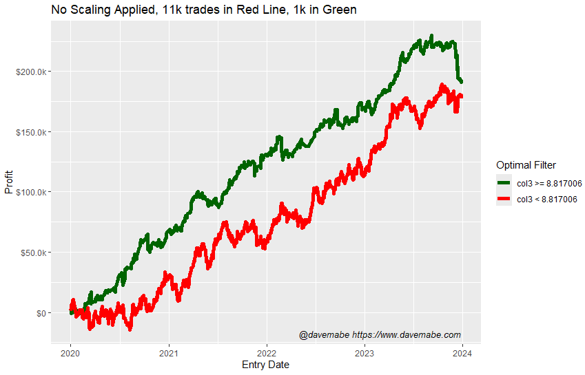
With this view, the red line doesn't look that bad, right?
But when you consider there's 11k trades in the red line and only 1k in the green line, it becomes very clear that the green line is overwhelmingly better!
That is, you only have to take 1/10 of the trades to achieve the same amount of total profit. This is a significant improvement in the trading strategy.
But you wouldn't know it by glancing at that chart!
To solve this and compare the lines in a fairer way, the optimizer applies scaling. How does it do that?
Scaling
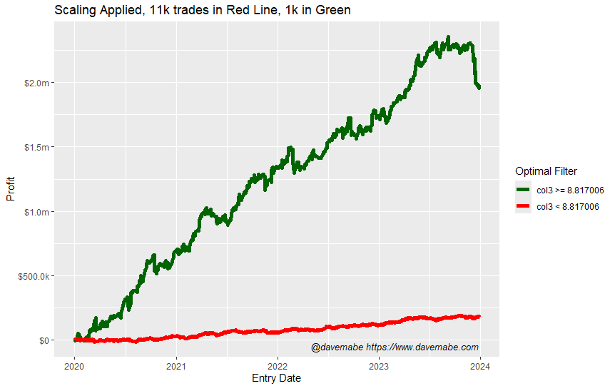
Instead of a one-to-one comparison using the original position sizing from your backtest, it simulates an equal amount of total capital applied to each line.
Here's the same chart as above, but with this scaling applied.
This make is much easier to compare the lines in a useful and more way.
Trade Offs
There are trade offs to this approach. Sometimes traders are expecting the one-to-one comparison so it can be confusing when you don't understand the scaling and why it's helping.
I'm open to feedback on this approach - feel free to email me with comments or suggestions: [email protected].